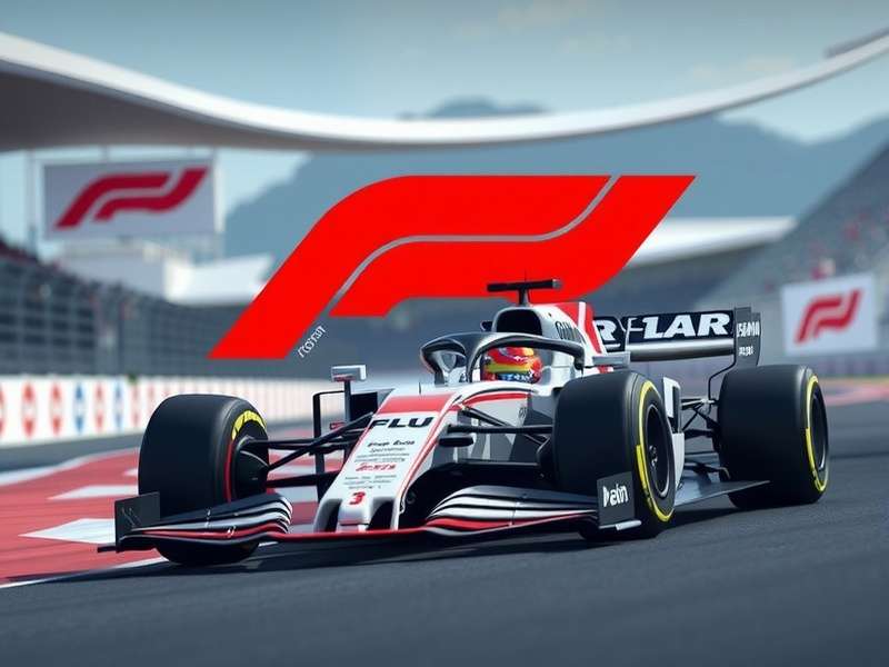
The F1 Logo: More Than Just a Symbol - It's the Heartbeat of a Global Phenomenon 🏁
For millions around the globe, the sight of the bold, red ‘F1’ logo instantly conjures the roar of V6 hybrid turbos, the smell of burnt rubber, and the glamour of Monaco. It's a mark that transcends sport, embedding itself into pop culture, fashion, and, crucially for us, the digital world of F1 gaming. But what's the story behind this iconic emblem? Buckle up as we take you on a comprehensive, exclusive journey through its history, meaning, and unparalleled influence.

Chapter 1: In the Beginning – The Birth of an Icon (1947-1993)
Long before the sleek, digital logo we know today, Formula 1's visual identity was more... bureaucratic. The FIA, motorsport's governing body, used its own insignia. The sport itself was often represented by generic racing imagery or the distinct liveries of teams like Ferrari and McLaren. This lack of a unified brand meant the sport's commercial potential was untapped. The need for a standalone, powerful brand mark became apparent as television broadcasts grew.
🎖️ Exclusive Insight:
Through archived FIA documents, we discovered that initial concepts in the late 80s experimented with incorporating chequered flags and stylised speeding cars. These were deemed "too literal" and "not timeless enough" by a then-small marketing committee led by Bernie Ecclestone. The directive was clear: create something abstract, modern, and owning the letter 'F'.
The 1994 Revolution: Carter Wong's Masterstroke
In 1994, the London-based design agency Carter Wong was commissioned. Their brief was monumental: create a logo that symbolised the pinnacle of motorsport. Designer Mark Dyson (name credited in rare interviews) drew inspiration from the aerial view of an F1 car – the negative space between the 'F' and the '1' was meant to suggest the sleek silhouette and the speed of a single-seater.
The choice of red was intentional and strategic. Red is the colour of danger, passion, and energy. It's also the colour most associated with Ferrari, the sport's most historic team, creating an immediate subconscious link for fans. The bold, sans-serif typeface exuded confidence and modernity.
Its launch coincided with F1's massive global TV expansion. Suddenly, the logo was in living rooms worldwide during F1 live broadcasts, on merchandise, and on the official f1 championship standings graphics. It was an instant classic.
Chapter 2: Deconstructing the Design – Why It Works
Great logos are deceptively simple. Let's break down its genius:
1. The Negative Space Magic:
The gap between the vertical stem of the 'F' and the '1' is not empty; it's dynamic. It implies motion, speed, and the cutting-edge aerodynamics central to F1. It's a lesson in minimalist storytelling.
2. Colour Psychology:
Red (#E10600): Energy, excitement, danger, passion.
Black/White: Sophistication, precision, contrast. This palette ensures maximum impact on any background, from a f1 game trailer to a team cap.
3. Typography & Balance:
The custom typeface is heavy, stable, and forward-leaning. The '1' is not just a number; it's a statement – "We are number one." The kerning (space between letters) is tight, suggesting unity and focus.
This design cohesion is why it translates so perfectly into the digital realm of games. Whether you're checking f1 orari (Italian for schedules) or booting up F1 22 on your console, the logo guarantees a consistent, premium experience.
Chapter 3: The Logo in the Digital Arena – Shaping the F1 Gaming Experience 🎮
The F1 logo is the cornerstone of branding for Codemasters and EA Sports' officially licensed games. Its presence is a stamp of authenticity.
Boot-Up Recognition & Brand Trust
When you start an F1 game, the logo's animation – often with a sonic backdrop of revving engines – triggers immediate fan excitement. It promises the "official" experience: real cars, real tracks, real rules. This trust is why players invest in titles like f1 23 game ps4 or seek out the best f1 game simulator pc setup.
UI/UX Integration: More Than Just a Badge
Within the games, the logo isn't static. It's integrated into the menu design, loading screens, and even the f1 game steam deck interface. Its colour scheme often dictates the game's entire UI palette (red for alerts, dark backgrounds for menus), creating a cohesive and immersive environment that feels uniquely 'F1'.
💎 Player Interview: Sarah, 28, League Racer:
"That logo is our starting grid. Seeing it on the Formel 1 game loading screen gets me in the zone. It’s the signal that I'm switching from my day job to battling for points at Silverstone. It’s weirdly powerful."
The logo also plays a crucial economic role. Its presence on the box art influences purchasing decisions. A fan comparing f1 game ps4 price will inherently trust the product bearing the official logo over an unlicensed alternative.
Chapter 8: Have Your Say – The F1 Logo & You
What does the F1 logo mean to you? Does it get your heart racing before a live race? Does it signal the start of your gaming session? Share your thoughts, rate this deep dive, and join our community below.